LemonStand Version 1 Has Been Discontinued
This documentation is for LemonStand Version 1. LemonStand is now offered as a cloud-based eCommerce platform.
You can try the new LemonStand and learn about upgrading here.
Standard Page Elements
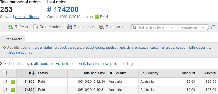
Administration Area pages provided by third-party modules should be consistent and visually compatible with pages supplied by native LemonStand modules. LemonStand framework helps to achieve this goal by automating many common tasks like generating buttons, lists, forms and data preview forms (read-only forms). You do not need to write any HTML markup for such page elements. For example, to output the Orders page we have coded manually only the indicators area, which displays the total number of orders and last order information. All other elements were generated by different LemonStand behaviors, which we will describe later in this guide.
Breadcrumbs
Breadcrumbs should display a path to a current page. Each page name in the path, excepting the current page, should have a link to a corresponding Administration Area page.

Breadcrumbs should be displayed on the top of a page. To output breadcrumbs you should use the a code similar to the following:
<ul class="breadcrumbs">
  <li><a href="<?= url('shop/orders') ?>">Orders</a></li>
  <li><a href="<?= url('shop/orders/preview/'.$order_id) ?>">Order Preview</a></li>
  <li><?= $this->app_page_title ?></li>
</ul>
The url() function has been described in the Adding a back-end user interface article.
Indicators
We use indicators for displaying important data above forms and lists:
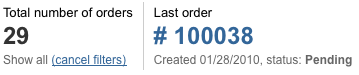
To output indicators please use a code similar to the following:
<div class="scoreboardReport">
  <ul>
    <li>
      <h3>Total number of orders</h3>
      <p>29</p>
      <p class="description">
        Some description text
      </p>
    </li>
    <li class="last">
      <h3>Last order</h3>
      <p><a href="<?= url('shop/orders/preview/100038') ?>"># 100038</a></p>
      <p class="description">
        Some description text
      </p>
    </li>
  </ul>
  <div class="clear"></div>
</div>
Please note that the LI element corresponding to the last indicator has the "last" CSS class assigned. It removes the gray border after the indicator.
When you output indicators above a toolbar (a set of buttons), you should wrap the indicators element into another DIV element with the "minorPadding" CSS class assigned:
<div class="minorPadding">
  <div class="scoreboardReport">
    ...
  </div>
</div>
Buttons
There are two types of buttons in LemonStand - link buttons and AJAX buttons. AJAX buttons will be described in the Using AJAX. To output a link button use the following markup:
<?= backend_button('Create order', url('/shop/orders/create')) ?>Also it is possible to call a JavaScript function when user clicks a button:
<?= backend_button('Click me!', array('href'=>'#', 'onclick'=>"alert('Hi!'); return false")) ?>Sometimes you will need to create right-aligned buttons. For example, we always place the Delete button on the right side. Use the right CSS class for it:
<?= backend_button('Click me!', array('class'=>'right')) ?>Buttons are floating elements, and you always need to add a clearing element after the buttons markup:
<div class="clear"></div>
LemonStand supports default buttons. Their onclick handler code is triggered when a user presses ctrl+enter key combination. To create a default button, add the default CSS class to the button declaration.
<?= backend_button('Click me!', array('href'=>'#', 'onclick'=>"alert('Hi!'); return false", 'class'=>'default')) ?>
-- or --
<?= backend_ajax_button('Save', 'edit_onSave',  array('class'=>'default')) ?>
Toolbars
Toolbars are a set of buttons with images, which we usually use above lists. There are two types of toolbars - integrated with lists, like on the picture below, and standalone.

Standalone toolbars
Use standalone toolbars if you do not need to integrate a toolbar with list controls. To define a toolbar use the following markup:
<div class="toolbar">
<?= backend_ctr_button('Create customer', 'new_document', url('/shop/customers/create')) ?>
<div class="separator"> </div>
<?= backend_ctr_button('Delete', 'delete_document', array('href'=>'#', 'onclick'=>"return delete_selected()")) ?>
<div class="clear"></div>
</div>The backend_ctr_button() function creates a toolbar button. The function parameters are similar to the backend_button function parameters, described above, but the second parameter should specify a CSS class for the button. CSS classes determine an image to be used for a button. There are many standard classes defined in the modules/backend/resources/css/backend.css file. For example:
- new_document
- refresh
- lorry
- delete_document
- restore_document
- document_export
- go_back
- apply
Try to use existing classes for your buttons. Always use the new_document class for Create buttons and delete_document for Delete buttons. If you need more icons, you can define corresponding CSS classes in your module CSS files and link the CSS file to your module pages. Please use the Silk Icons icon set for new buttons.
Toolbars integrated with list controls
We use integrated toolbars for cases when we need to embed list controls into the toolbar, like on the Shop/Products page and on many other pages in the Administration Area. Integrated toolbars require an external partial. Create a new partial and place the toolbar code into it. The integrated and standalone toolbar codes are similar.
Then you render the list, pass a name of your toolbar partial with the list_control_panel parameter to the listRender() function call:
<?= $this->listRender(array('list_control_panel'=>'my_toolbar')) ?>Next: Handling Errors and Displaying Status Messages
Previous: Partials
Return to Adding a Back-End User Interface